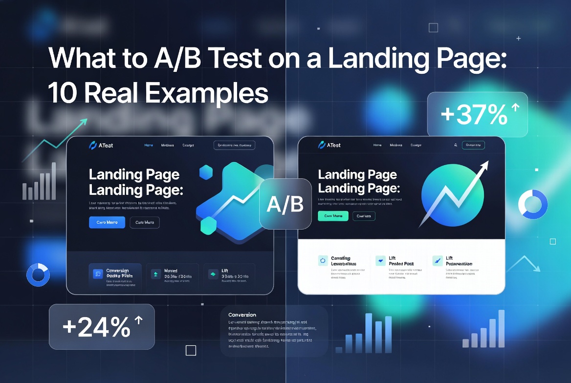
What to A/B Test on a Landing Page: 10 Real Examples to Skyrocket Conversions
Landing pages are your digital salespeople. They work 24/7 to turn cold traffic into leads and customers. Yet most businesses settle for “good enough” and leave massive conversion gains on the table.
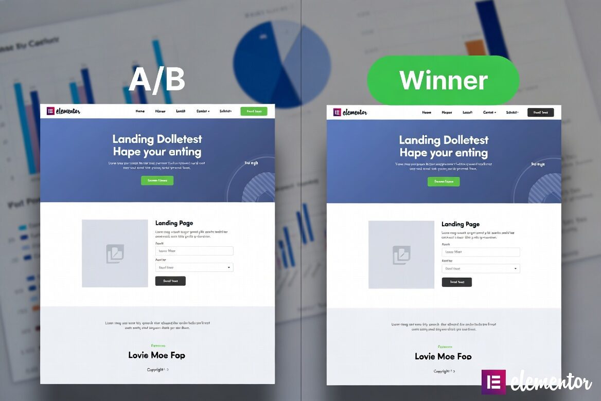
A/B testing (split testing) lets you compare two versions of a page to see which performs better. Even small changes can deliver 10–300% lifts in conversions. At Knix Agency, we’ve used systematic A/B testing to help clients dramatically improve lead quality and sales.
Here are 10 high-impact elements to A/B test on your landing pages, with real-world examples and expected outcomes.
1. Headlines
Your headline is the first thing visitors read. It determines whether they stay or bounce.
Test ideas:
- Benefit-driven vs. feature-driven (“Double Your Revenue in 90 Days” vs. “AI-Powered Marketing Automation”)
- Question format vs. statement (“Tired of Low Conversion Rates?” vs. “The #1 Mistake Killing Your Conversions”)
- Short vs. long headlines
Real example: A SaaS client increased sign-ups by 41% by changing from a generic headline to one that spoke directly to their biggest pain point.
2. Call-to-Action (CTA) Buttons
CTA text, color, size, and placement dramatically affect click-through rates.
Test ideas:
- “Get Started Free” vs. “Start My Free Trial” vs. “Claim Your Audit”
- Red vs. green vs. blue buttons
- Above-the-fold single CTA vs. multiple strategic CTAs
Real example: Switching from “Submit” to “Get My Free Strategy Session” boosted conversions by 28% for a consulting firm.
- Use first-person language (“Get My Free Report” instead of “Get Your Free Report”) — it often increases clicks.
- Make the button large enough to be thumb-friendly on mobile (minimum 48px height).
- Test adding urgency micro-copy directly on the button (e.g., “Start Free Trial → Today”).
- Place a secondary CTA at the bottom for visitors who have scrolled and are convinced.
3. Hero Images or Videos
Visuals create instant emotional connections (or disconnects).
Test ideas:
- Stock photo vs. custom illustration vs. real customer photo
- Product in use vs. happy customer results
- Static image vs. short looping video
Real example: An e-commerce brand replaced a generic stock image with a customer testimonial video in the hero section, lifting conversions by 67%.
4. Form Length and Fields
Every extra field increases friction.
Test ideas:
- Short form (Name + Email) vs. longer form with qualification questions
- Single-step vs. multi-step forms
- Progressive profiling (collect more data later)
Real example: Reducing fields from 7 to 3 increased form completions by 52% while maintaining lead quality through smart qualification.
5. Social Proof Placement and Type
Trust elements reduce anxiety and boost credibility.
Test ideas:
- Testimonials above the fold vs. below the fold
- Logo wall vs. detailed case studies
- Review count (“Join 12,458 others”) vs. specific quotes
- Third-party review widgets (Trustpilot, G2) vs. internal testimonials
6. Pricing Presentation
How you display pricing heavily influences perceived value.
Test ideas:
- Monthly vs. annual billing (with savings highlighted)
- Tiered pricing with “Most Popular” badge
- Price anchoring (showing crossed-out higher price)
- “Starting at” vs. exact pricing
Real example: Adding an annual toggle with 20% savings highlighted increased average order value by 34%.
7. Page Layout and Structure
The overall flow affects how easily visitors can scan and convert.
Test ideas:
- Long-form sales page vs. shorter scannable layout
- One-column vs. two-column design
- Sticky navigation/header vs. static
- Z-pattern vs. F-pattern content layout
8. Body Copy Length and Tone
Different audiences respond to different levels of detail.
Test ideas:
- Short, benefit-heavy copy vs. detailed, feature-rich copy
- Conversational tone vs. professional tone
- Bulleted benefits vs. paragraph format
Real example: A B2B service page saw 39% more conversions after switching to shorter, scannable copy with more white space.
9. Trust Signals and Risk Reversals
Remove objections before they appear.
Test ideas:
- Money-back guarantees vs. “No credit card required”
- Security badges and certifications
- “As seen in” media mentions
- Live chat availability indicators
10. Urgency and Scarcity Elements
Gentle urgency can push fence-sitters to act.
Test ideas:
- Limited-time offer countdown timers
- “Only X spots left” messaging
- “Price increases in 48 hours”
- Real-time visitor counters
How to Run Effective A/B Tests (Best Practices)
- Test one variable at a time for clear results
- Run tests for at least 7–14 days or until statistically significant
- Aim for at least 1,000–5,000 visitors per variation
- Use tools like Google Optimize (now part of Google Analytics), VWO, Optimizely, or Convert
- Track micro-conversions (time on page, scroll depth) alongside macro conversions
- Document everything and build a testing roadmap
Consistent testing compounds. One client ran 27 tests over 9 months and improved their overall conversion rate from 4.2% to 18.7%.
A/B testing is one of the smartest ways to boost your landing page conversions and maximize your ad spend. Small, strategic changes can deliver outsized results that compound over time. Instead of guessing what works, let the data guide you.
At Knix Agency, we are premium A/B testing and conversion optimization consultants who help businesses turn average landing pages into high-performing conversion machines.
Ready to dramatically improve your results?
Book your free Landing Page A/B Testing Audit →